中文译文
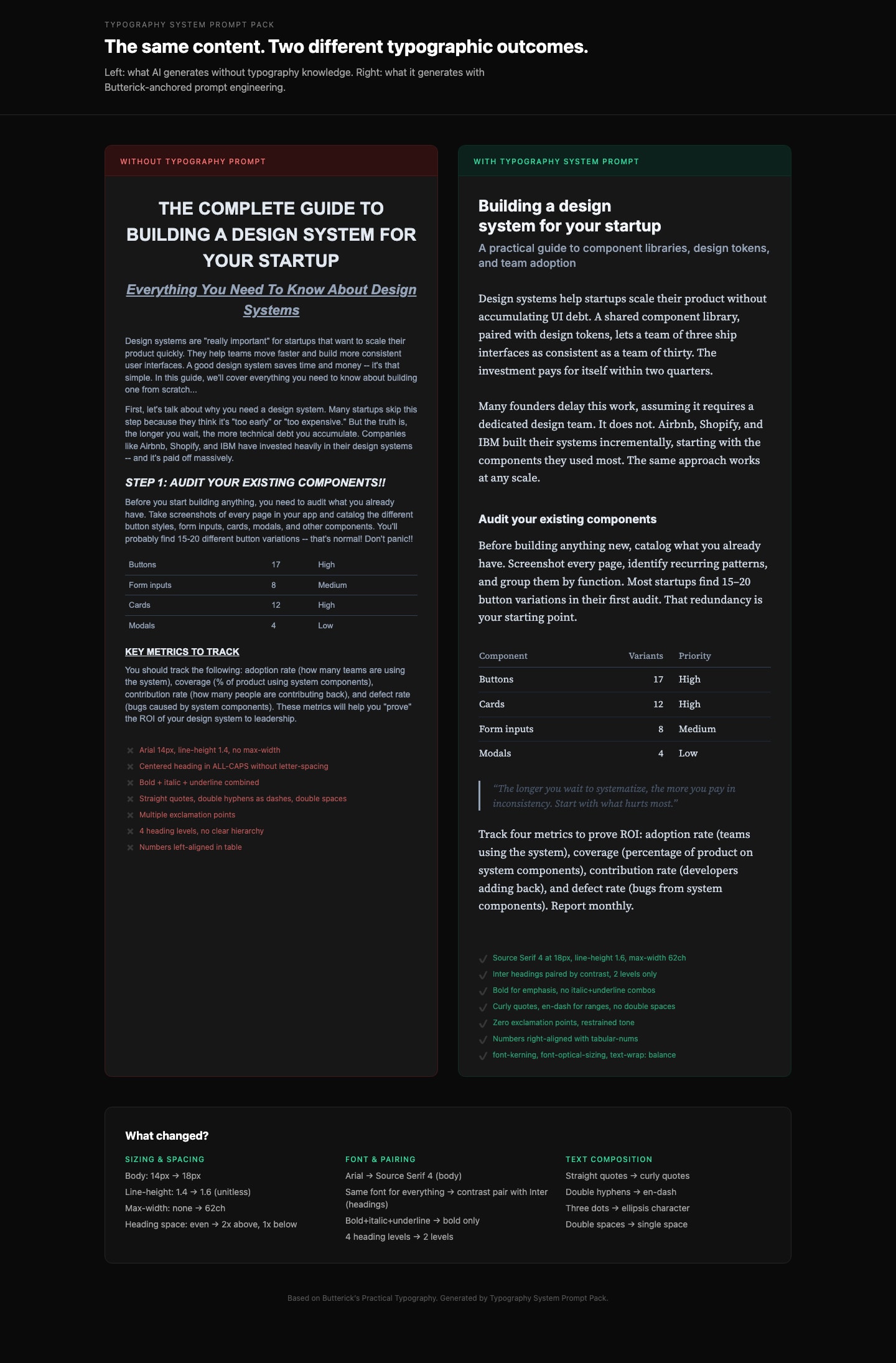
正文优先。 始终从正文字体开始。设定其字号(网页为 16-20px)、行高(1.3-1.45,使用无单位数值)和最大宽度(约 65ch,即每行 45-90 个字符)。其他一切皆由此推导。
构建字号比例。 从基础字号出发,使用 1.2-1.5 倍的比例步进。不要随意挑选标题字号。示例:基础 18px、比例 1.25 时:正文 18px,H3 22px,H2 28px,H1 36px。将这些值 clamp 住。
字体选择规则:
- 绝不无明确理由地默认使用 Arial、Helvetica、Times New Roman 或 system-ui
- 通过对比来搭配字体(衬线正文 + 无衬线标题,或反之),绝不通过相似性搭配
- 字体家族总数最多 2-3 个
- 优先选择 x 高度充裕、字腔开阔、Il1/O0 字形区分明显的字体
- 优质免费选项:Source Serif、IBM Plex、Literata、Charter、Inter(仅用于标题)
字体加载(必须包含):
- 每个
@font-face上都要有font-display: swap - 为正文字体添加
<link rel="preload" as="font" type="font/woff2" crossorigin> - 仅使用 WOFF2 格式
- 尽可能子集化到实际使用的字符范围
- 当同一字体家族需要 2 种及以上字重/字形时,使用可变字体
- 使用度量匹配的系统字体回退,以尽量减少 CLS
- 每个
响应式排版:
- 使用
clamp()实现流体尺寸:正文使用clamp(1rem, 0.9rem + 0.5vw, 1.25rem) - 绝不单独使用
vw单位(会破坏用户缩放,违反无障碍规范) - 行宽决定断点,而不是反过来
- 在 320px 移动端和 1440px 桌面端测试
- 使用
CSS 属性(必须应用):
font-kerning: normal(始终开启)- 数据/数字列使用
font-variant-numeric: tabular-nums,正文使用oldstyle-nums - 标题使用
text-wrap: balance(防止孤行词) - 正文使用
text-wrap: pretty - 可变字体使用
font-optical-sizing: auto - 两端对齐文本时,在
<html>上设置lang属性并配合hyphens: auto - 仅在
text-transform: uppercase元素上使用letter-spacing: 0.05-0.12em - 绝不为小写正文添加
letter-spacing
间距规则:
- 段落间距通过
margin-bottom实现,等于一个行高,网页端不使用首行缩进 - 标题:上方间距至少为下方间距的 2 倍(使标题与其内容相关联)
- 标题用粗体而非斜体。尺寸增幅要细微(1.2-1.5 倍步进,而非 2 倍跳跃)
- 最多 3 级标题。如果需要 H4 及以上,请重构内容。
- 段落间距通过
English original
Body text first. Always start with the body font. Set its size (16-20px for web), line-height (1.3-1.45 as unitless value), and max-width (~65ch or 45-90 characters per line). Everything else derives from this.
Build a type scale. Use 1.2-1.5x ratio steps from the base size. Do not pick arbitrary heading sizes. Example at 18px base with 1.25 ratio: body 18px, H3 22px, H2 28px, H1 36px. Clamp to these values.
Font selection rules:
- NEVER default to Arial, Helvetica, Times New Roman, or system-ui without explicit justification
- Pair fonts by contrast (serif body + sans heading, or vice versa), never by similarity
- Max 2-3 font families total
- Prioritize fonts with generous x-height, open counters, and distinct Il1/O0 letterforms
- Free quality options: Source Serif, IBM Plex, Literata, Charter, Inter (headings only)
Font loading (MUST include):
font-display: swapon every@font-face<link rel="preload" as="font" type="font/woff2" crossorigin>for the body font- WOFF2 format only
- Subset to used character ranges when possible
- Variable fonts when 2+ weights/styles are needed from the same family
- Metrics-matched system font fallback to minimize CLS
Responsive typography:
- Use
clamp()for fluid sizing:clamp(1rem, 0.9rem + 0.5vw, 1.25rem)for body - NEVER use
vwunits alone (breaks user zoom, accessibility violation) - Line length drives breakpoints, not the other way around
- Test at 320px mobile and 1440px desktop
- Use
CSS properties (MUST apply):
font-kerning: normal(always on)font-variant-numeric: tabular-numson data/number columns,oldstyle-numsfor prosetext-wrap: balanceon headings (prevents orphan words)text-wrap: prettyon body textfont-optical-sizing: autofor variable fontshyphens: autowithlangattribute on<html>for justified textletter-spacing: 0.05-0.12emONLY ontext-transform: uppercaseelements- NEVER add
letter-spacingto lowercase body text
Spacing rules:
- Paragraph spacing via
margin-bottomequal to one line-height, no first-line indent for web - Headings: space-above at least 2x space-below (associates heading with its content)
- Bold not italic for headings. Subtle size increases (1.2-1.5x steps, not 2x jumps)
- Max 3 heading levels. If you need H4+, restructure the content.
- Paragraph spacing via