中文译文
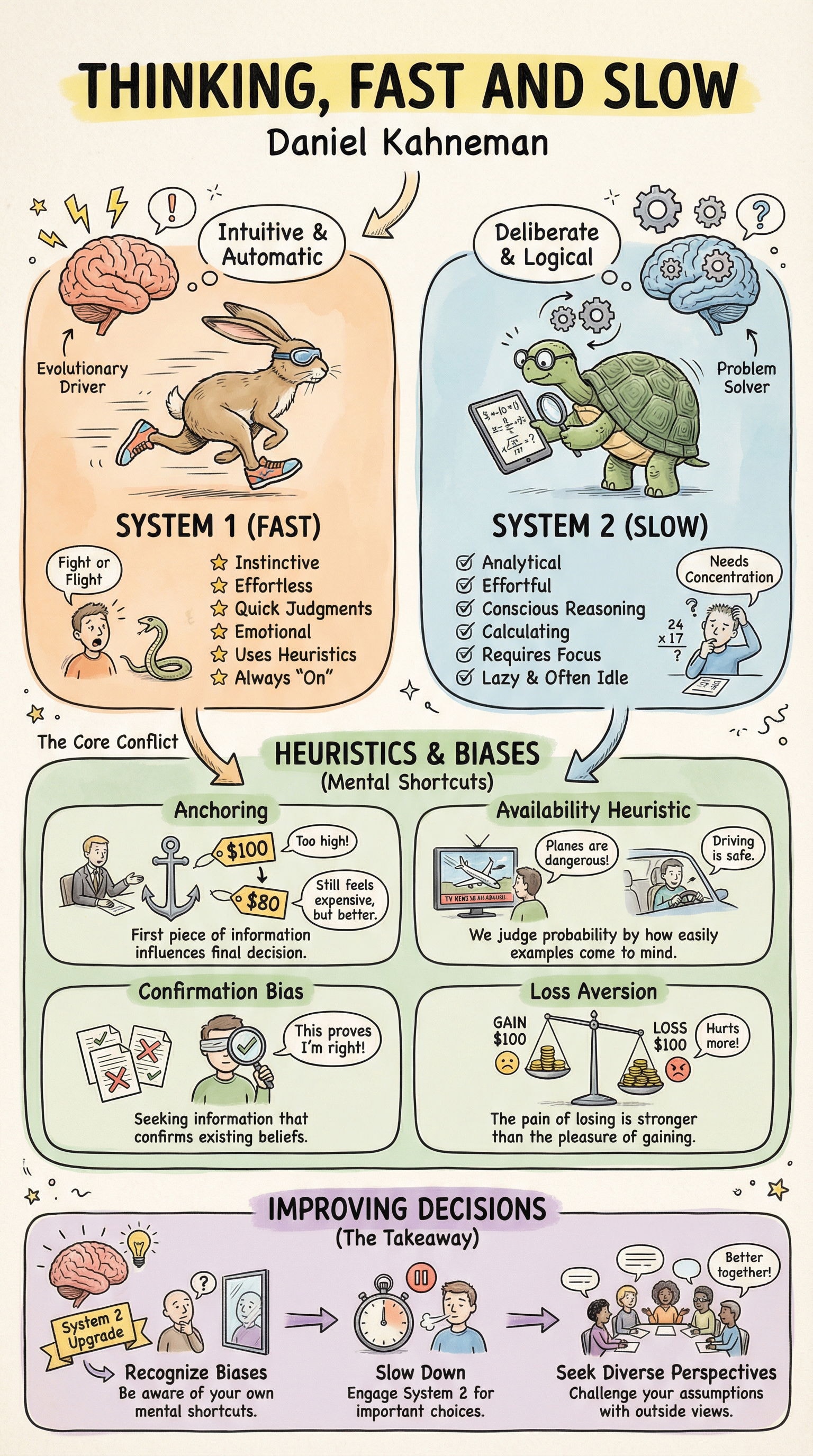
解释《思考,快与慢》这本书
{ "style": { "name": "白板信息图", "description": "手绘风格的教育信息图,具有温暖、亲切的素描美学。上传你的内容大纲,即可获得一份视觉化组织、素描本风格的指南,感觉像是手工制作,却又具备专业结构。" }, "visual_foundation": { "surface": { "base": "米白到暖奶油色背景", "texture": "细腻的纸张纹理——不冰冷,不数字化", "edges": "内容完全延伸至边缘,无边框或画框,无缝收尾", "feel": "就像直接看着一页整理得当的笔记本" }, "overall_impression": "平易近人的专业感——通过手绘的温暖让复杂信息变得友好" }, "illustration_style": { "line_quality": { "type": "手绘墨水素描美学", "weight": "主要元素用中等笔触,细节用较细笔触", "character": "自信但不完美——轻微的抖动证明人手痕迹", "edges": "柔和,不是矢量级的锐利,角落偶有线条重叠", "fills": "松散的排线,阴影用轻柔的交叉排线,绝不用机器实心填充" }, "icon_treatment": { "style": "简单、迷人、略带稚拙感的插画", "complexity": "精简到基本形态——小尺寸下依然可辨识", "personality": "友好而亲切,绝不企业化或冰冷", "consistency": "看起来像是同一只手画出了所有东西" }, "human_figures": { "style": "简单友好的角色,不做解剖学细节", "faces": "极简五官——点状眼睛,简单表情", "poses": "清晰、有行动感、有交流性的手势", "diversity": "多样的轮廓,暗示不同的人群" }, "objects_and_scenes": { "approach": "可辨识的简化素描", "detail_level": "刚好足以辨认——笔记本电脑、手机、建筑、人物", "perspective": "随意的等距或平面视角,不是严格的技术制图", "charm": "轻微的不完美增添真实感" } }, "color_philosophy": { "palette_character": { "mood": "温暖、乐观、有活力但不压倒一切", "saturation": "中等——鲜艳到足以引导视线,柔和到感觉像是手工上色", "harmony": "互补色与类似色组合,感觉是有意为之" }, "primary_palette": { "yellows": "暖金黄色、柔和芥末黄——用于高光、背景、活力", "greens": "清新叶绿色、柔和青绿色——用于成功、成长、自然、金钱主题", "blues": "平静天蓝色、柔和藏青色——用于信任、科技、稳定", "oranges": "暖珊瑚色、柔和蜜桃色——用于温暖、行动号召、友好提示" }, "supporting_palette": { "neutrals": "暖灰色、柔和棕色、奶油色——绝不冰冷或刺眼", "blacks": "线条用柔和炭黑色,绝不用纯 #000000", "whites": "奶油色和米白色,纸张色调" }, "color_application": { "fills": "水彩般的晕染,略微不均匀,透明层次", "backgrounds": "柔和的色块用于划分内容区域,温和的圆角矩形", "accents": "策略性地使用更明亮的色彩点缀以引导层级", "technique": "颜色可以略微溢出线条边界——手绘上色的感觉" } }, "typography_integration": { "headline_style": { "appearance": "粗体手写感,基线略微不均匀", "weight": "厚重、自信、引人注目", "case": "主要标题通常使用大写", "color": "深炭色或策略性色彩以强调" }, "subheadings": { "appearance": "中等字重,仍保持手绘特征", "decoration": "可包含下划线、简单横幅或高亮框", "hierarchy": "与标题相比尺寸明显缩小" }, "body_text": { "appearance": "简洁但温暖,在较小尺寸下仍可读", "style": "具有手写个性的无衬线字体,或真正的手写字体", "spacing": "宽松,绝不拥挤" }, "annotations": { "style": "随性的手写笔记,箭头指向各元素", "purpose": "添加说明、强调或个性", "placement": "自然有机,如同在讲解时随手添加" } }, "layout_architecture": { "canvas": { "framing": "无边框,无画框,无边缘装饰", "boundary": "内容使用整个画布——元素可以触及或溢出至边缘", "containment": "信息图本身就是图像,而不是信息图的图像" }, "structure": { "type": "具有有机灵活性的模块化网格", "sections": "清晰的数字或字母分区", "flow": "从左到右、从上到下,以视觉层级引导视线", "breathing_room": "充裕的留白以防止压迫感" }, "section_treatment": { "borders": "柔和的圆角矩形、手绘方框或色块背景", "separation": "清晰但不僵硬——各区域感觉相连却又各自独立", "numbering": "圆圈数字、徽章或趣味性指示符" }, "visual_flow_devices": { "arrows": "手绘风格、略微弯曲、友好的指示箭头", "connectors": "虚线、展示关系的简单路径", "progression": "前后对比布局、步骤序列、转化箭头" } }, "information_hierarchy": { "levels": { "primary": "大号粗体标题、明亮色彩点缀、主要插图", "secondary": "副标题、关键图标、区域背景", "tertiary": "正文、辅助细节、注释", "ambient": "纹理、细微装饰、背景元素" }, "emphasis_techniques": { "color_highlights": "黄色马克笔风格的关键词高亮", "size_contrast": "层级之间显著的尺寸差异", "boxing": "重要项目置于圆角矩形或徽章形状中", "icons": "用对勾、星形、感叹号进行强调" } }, "decorative_elements": { "badges_and_labels": { "style": "缎带横幅、圆形徽章、标签形状", "use": "区块标签、关键术语、行动号召", "character": "手绘感、略微不完美、富有魅力" }, "connective_tissue": { "arrows": "弯曲、手绘感、多种箭头样式", "lines": "虚线路径、简单分隔线、下划线", "brackets": "用花括号将相关项目分组" }, "ambient_details": { "small_icons": "星形、对勾、圆点、闪光", "doodles": "用小巧的相关涂鸦填补空白区域", "texture": "整体带有细腻的纸张纹理" } }, "authenticity_markers": { "hand_made_quality": { "line_variation": "自然的粗细变化,如同真实笔压绘制", "color_bleeds": "略微溢出线条,水彩风格的边缘", "alignment": "刻意不完美——文字和元素略微偏离网格", "overlap": "元素可略微重叠,营造纵深感和活力" }, "material_honesty": { "paper_feel": "暖调米白色,带有细腻纹理", "ink_quality": "柔和的炭黑色,绝不刺眼", "marker_fills": "略带条纹感,透明层次可见" }, "human_evidence": { "corrections": "偶尔可见的修改痕迹增添真实感", "spontaneity": "部分元素感觉像是事后补充——批注、小箭头", "personality": "整幅作品感觉像是一个人的视觉思考" } }, "technical_quality": { "resolution": "高分辨率输出,适用于印刷和数字媒介", "clarity": "所有文字可读,所有图标可辨识", "balance": "视觉重量在整体构图中均匀分布", "completeness": "感觉已完成但不过度修饰——自信的收尾点" }, "enhancements_beyond_reference": { "depth_additions": { "subtle_shadows": "区块框下方柔和的投影,营造悬浮感", "layering": "重叠元素营造视觉纵深", "dimension": "徽章和关键元素带有轻微 3D 感" }, "polish_improvements": { "color_harmony": "更有意图的配色关系", "spacing_rhythm": "一致的边距和栏间距", "hierarchy_clarity": "内容层级之间更强的区分度" }, "engagement_boosters": { "focal_points": "清晰的视觉锚点引导视线", "progression": "令人愉悦的视觉旅程贯穿内容", "reward_details": "细看之下有小而惊喜的发现" } }, "avoid": [ "信息图周围的任何边框、边线或边缘装饰", "木框或白板框效果", "整张图片周围带投影,仿佛它是某样东西的照片", "图片看起来像一张海报的照片——它本身就是海报", "无菌的矢量级完美——这应当有手工感", "冷冽的纯白或刺眼的纯黑", "僵硬的机械网格对齐", "企业剪贴画美学", "令人窒息的细节密度——让它有呼吸感", "冲突的霓虹色或俗艳的色彩组合", "通篇统一的线条粗细", "完全均匀的色块填充", "僵硬、毫无生气的人物形象", "扼杀温度的数码锐利感", "同一作品内插图风格不一致", "文字密集的段落缺乏视觉缓冲" ] }
English original
explain the thinking fast and slow book
{ "style": { "name": "Whiteboard Infographic", "description": "Hand-illustrated educational infographic with a warm, approachable sketch aesthetic. Upload your content outline and receive a visually organized, sketchbook-style guide that feels hand-crafted yet professionally structured." }, "visual_foundation": { "surface": { "base": "Off-white to warm cream background", "texture": "Subtle paper grain—not sterile, not digital", "edges": "Content extends fully to edges, no border or frame, seamless finish", "feel": "Like looking directly at a well-organized notebook page" }, "overall_impression": "Approachable expertise—complex information made friendly through hand-drawn warmth" }, "illustration_style": { "line_quality": { "type": "Hand-drawn ink sketch aesthetic", "weight": "Medium strokes for main elements, thinner for details", "character": "Confident but imperfect—slight wobble that proves human touch", "edges": "Soft, not vector-crisp, occasional line overlap at corners", "fills": "Loose hatching, gentle cross-hatching for shadows, never solid machine fills" }, "icon_treatment": { "style": "Simple, charming, slightly naive illustration", "complexity": "Reduced to essential forms—readable at small sizes", "personality": "Friendly and approachable, never corporate or sterile", "consistency": "Same hand appears to have drawn everything" }, "human_figures": { "style": "Simple friendly characters, not anatomically detailed", "faces": "Minimal features—dots for eyes, simple expressions", "poses": "Clear, action-oriented, communicative gestures", "diversity": "Varied silhouettes and suggestions of different people" }, "objects_and_scenes": { "approach": "Recognizable simplified sketches", "detail_level": "Just enough to identify—laptop, phone, building, person", "perspective": "Casual isometric or flat, not strict technical drawing", "charm": "Slight imperfections add authenticity" } }, "color_philosophy": { "palette_character": { "mood": "Warm, optimistic, energetic but not overwhelming", "saturation": "Medium—vibrant enough to guide the eye, soft enough to feel hand-colored", "harmony": "Complementary and analogous combinations that feel intentional" }, "primary_palette": { "yellows": "Warm golden yellow, soft mustard—for highlights, backgrounds, energy", "greens": "Fresh leaf green, soft teal—for success, growth, nature, money themes", "blues": "Calm sky blue, soft navy—for trust, technology, stability", "oranges": "Warm coral, soft peach—for warmth, calls-to-action, friendly alerts" }, "supporting_palette": { "neutrals": "Warm grays, soft browns, cream—never cold or stark", "blacks": "Soft charcoal for lines, never pure #000000", "whites": "Cream and off-white, paper-toned" }, "color_application": { "fills": "Watercolor-like washes, slightly uneven, transparent layers", "backgrounds": "Soft color blocks to section content, gentle rounded rectangles", "accents": "Strategic pops of brighter color to guide hierarchy", "technique": "Colors may slightly escape line boundaries—hand-colored feel" } }, "typography_integration": { "headline_style": { "appearance": "Bold hand-lettered feel, slightly uneven baseline", "weight": "Heavy, confident, attention-grabbing", "case": "Often uppercase for major headers", "color": "Dark charcoal or strategic color for emphasis" }, "subheadings": { "appearance": "Medium weight, still hand-drawn character", "decoration": "May include underlines, simple banners, or highlight boxes", "hierarchy": "Clear size reduction from headlines" }, "body_text": { "appearance": "Clean but warm, readable at smaller sizes", "style": "Sans-serif with hand-written personality, or actual handwriting font", "spacing": "Generous, never cramped" }, "annotations": { "style": "Casual handwritten notes, arrows pointing to elements", "purpose": "Add explanation, emphasis, or personality", "placement": "Organic, as if added while explaining" } }, "layout_architecture": { "canvas": { "framing": "NO BORDER, NO FRAME, NO EDGE DECORATION", "boundary": "Content uses full canvas—elements may touch or bleed to edges", "containment": "The infographic IS the image, not an image of an infographic" }, "structure": { "type": "Modular grid with organic flexibility", "sections": "Clear numbered or lettered divisions", "flow": "Left-to-right, top-to-bottom with visual hierarchy guiding the eye", "breathing_room": "Generous white space preventing overwhelm" }, "section_treatment": { "borders": "Soft rounded rectangles, hand-drawn boxes, or color-blocked backgrounds", "separation": "Clear but not rigid—sections feel connected yet distinct", "numbering": "Circled numbers, badges, or playful indicators" }, "visual_flow_devices": { "arrows": "Hand-drawn, slightly curved, friendly pointers", "connectors": "Dotted lines, simple paths showing relationships", "progression": "Before/after layouts, step sequences, transformation arrows" } }, "information_hierarchy": { "levels": { "primary": "Large bold headers, bright color accents, main illustrations", "secondary": "Subheadings, key icons, section backgrounds", "tertiary": "Body text, supporting details, annotations", "ambient": "Texture, subtle decorations, background elements" }, "emphasis_techniques": { "color_highlights": "Yellow marker-style highlighting behind key words", "size_contrast": "Significant scale difference between hierarchy levels", "boxing": "Important items in rounded rectangles or badge shapes", "icons": "Checkmarks, stars, exclamation points for emphasis" } }, "decorative_elements": { "badges_and_labels": { "style": "Ribbon banners, circular badges, tag shapes", "use": "Section labels, key terms, calls-to-action", "character": "Hand-drawn, slightly imperfect, charming" }, "connective_tissue": { "arrows": "Curved, hand-drawn, with various head styles", "lines": "Dotted paths, simple dividers, underlines", "brackets": "Curly braces grouping related items" }, "ambient_details": { "small_icons": "Stars, checkmarks, bullets, sparkles", "doodles": "Tiny relevant sketches filling awkward spaces", "texture": "Subtle paper grain throughout" } }, "authenticity_markers": { "hand_made_quality": { "line_variation": "Natural thickness changes as if drawn with real pen pressure", "color_bleeds": "Slight overflow past lines, watercolor-style edges", "alignment": "Intentionally imperfect—text and elements slightly off-grid", "overlap": "Elements may slightly overlap, creating depth and energy" }, "material_honesty": { "paper_feel": "Warm off-white with subtle texture", "ink_quality": "Soft charcoal blacks, never harsh", "marker_fills": "Slightly streaky, transparent layers visible" }, "human_evidence": { "corrections": "Occasional visible rework adds authenticity", "spontaneity": "Some elements feel added as afterthoughts—annotations, small arrows", "personality": "The whole piece feels like one person's visual thinking" } }, "technical_quality": { "resolution": "High-resolution output suitable for print and digital", "clarity": "All text readable, all icons recognizable", "balance": "Visual weight distributed evenly across the composition", "completeness": "Feels finished but not overworked—confident stopping point" }, "enhancements_beyond_reference": { "depth_additions": { "subtle_shadows": "Soft drop shadows under section boxes for lift", "layering": "Overlapping elements creating visual depth", "dimension": "Slight 3D feel on badges and key elements" }, "polish_improvements": { "color_harmony": "More intentional palette relationships", "spacing_rhythm": "Consistent margins and gutters", "hierarchy_clarity": "Stronger differentiation between content levels" }, "engagement_boosters": { "focal_points": "Clear visual anchors drawing the eye", "progression": "Satisfying visual journey through the content", "reward_details": "Small delightful discoveries upon closer inspection" } }, "avoid": [ "ANY frame, border, or edge decoration around the infographic", "Wooden frame or whiteboard frame effect", "Drop shadow around the entire image as if it's a photo of something", "The image looking like a photograph of a poster—it IS the poster", "Sterile vector perfection—this should feel hand-made", "Cold pure whites or harsh blacks", "Rigid mechanical grid alignment", "Corporate clip-art aesthetic", "Overwhelming detail density—let it breathe", "Clashing neon or garish color combinations", "Uniform line weights throughout", "Perfectly even color fills", "Stiff, lifeless human figures", "Digital sharpness that kills the warmth", "Inconsistent illustration styles within the piece", "Text-heavy sections without visual relief" ] }