中文译文
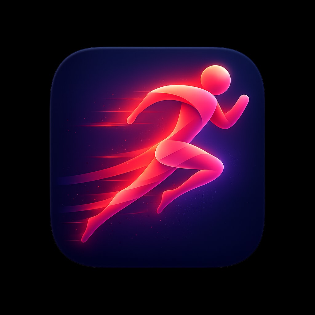
一款高端 iOS 应用图标,用于跑步与健身应用,画面主体是 一个风格化的抽象奔跑人物,处于运动之中,由流动的 渐变丝带构成,色彩从充满活力的珊瑚色过渡到鲜艳的 洋红色。人物带有拖尾的动态元素,传达出速度感与向前的冲势。 背景是深海军蓝,人物后方有微妙的径向渐变,略亮。 动感、充满活力、令人向往。柔和光照,人物周围带有微妙的光晕。 圆角方形格式,1024x1024px。
遵循以下规格以及所附的示例图标设计:
这些规格定义了高端、现代应用图标的视觉语言,正如顶级 iOS/macOS 应用中所见。目标是打造出精致、令人难忘、配得上旗舰产品的图标。
1. 画布与形状
基础形状
- 格式: 方形,带连续圆角(iOS「超椭圆」)
- 圆角半径: 约为图标宽度的 22-24%(模仿 Apple 的超椭圆)
- 宽高比: 1:1
- 推荐分辨率: 1024×1024px(可干净地缩小)
安全区
- 将主要元素保持在画布中心 80% 的范围内
- 允许微妙效果(光晕、阴影)接近边缘,但不得被裁切
2. 背景处理
纯色背景
- 深色/黑色: 纯黑(#000000)到深炭灰(#1C1C1E)——营造戏剧感,让元素更突出
- 鲜艳纯色: 高饱和度单色填充(电光蓝 #007AFF、暖橙 #FF9500)
- 渐变背景: 微妙的从上到下或径向渐变,增加层次感
渐变类型(使用时)
| 类型 | 描述 | 示例 |
|---|---|---|
| 线性 | 柔和过渡,通常顶部较亮 | 蓝天渐变 |
| 径向 | 中心发光效果,边缘较暗 | 聚光灯效果 |
| 角度 | 扫掠式色彩过渡 | 虹彩表面 |
纹理(微妙)
- 细密的垂直/水平线条,营造金属或织物质感
- 1-3% 不透明度的噪点颗粒,带来自然的温暖感
- 避免使用会与主符号相争的厚重纹理
3. 色彩调色板
主调色板特征
- 高饱和度: 色彩鲜艳但不霓虹
- 浓郁深色: 黑色和海军蓝占据显著位置
- 选择性亮色: 强调色少量使用以产生冲击力
推荐色系
冷色光谱
Navy/Deep Blue:    #0A1628, #1A2744, #2D4A7C
Electric Blue:     #007AFF, #5AC8FA, #64D2FF
Purple/Violet:     #5E5CE6, #BF5AF2, #AF52DE
Teal/Cyan:         #30D5C8, #5AC8FA, #32ADE6
暖色调
Orange:            #FF9500, #FF6B35, #FF3B30
Pink/Coral:        #FF6B8A, #FF2D55, #FF375F
Peach/Salmon:      #FFACA8, #FF8A80, #FFB199
中立者
True Black:        #000000
Soft Black:        #1C1C1E, #2C2C2E
White:             #FFFFFF
Off-White:         #F5F5F7, #E5E5EA
色彩和谐规则
- 每个图标限制在 2-3 种主色
- 使用互补色或类似色关系
- 一种颜色应占主导(60%),次要色(30%),点缀色(10%)
4. 光照与深度
光源
- 位置: 左上方或正上方(一致的 45° 角)
- 质感: 柔和、漫射——不要生硬的阴影
- 产生: 上表面的细微高光,下方的阴影
深度技法
高光
- 3D 形体顶部边缘的柔和白色/浅色渐变
- 镜面反射为小而亮的点(不要过于强烈)
- 朝向光源的边缘上的轮廓光
阴影
- 投影: 柔和、漫射,10-20% 不透明度,略微的 Y 轴偏移
- 内阴影: 非常细微,增加凹陷效果
- 接触阴影: 更深、更紧的阴影,直接位于物体下方
分层
- 元素应看起来悬浮在背景之上
- 使用空气透视(远处的元素略微朦胧)
- 重叠的形状营造自然的层次感
5. 符号与图标设计
风格取向
A. 立体/3D 物体
- 柔和、圆润的形体,具有清晰的体积感
- 细微的渐变暗示曲率
- 示例:纸飞机、翻开的书、球体
B. 带深度线索的扁平风格
- 简化的形状,配合策略性的阴影/高光
- 干净的几何形,带有轻微渐变
- 示例:火焰图标、罗盘表盘
C. 抽象/几何
- 重叠的半透明形状
- 相互咬合的形体,营造视觉趣味
- 示例:重叠的菱形、三角形构图
D. 玻璃拟态/半透明
- 带模糊效果的磨砂玻璃质感
- 看起来具有透明度的形状
- 细微的折射与色彩渗染
符号特征
- 简洁性: 在 16×16px 下仍可辨识
- 平衡: 视觉重量居中或刻意呈现动态
- 原创性: 避免通用的剪贴画感
- 隐喻: 符号与应用功能明确相关
推荐符号比例
- 主符号:占图标画布的 50-70%
- 在边缘周围留出呼吸空间
- 视觉居中(可能与数学中心不同)
6. 材质与表面质感
哑光表面
- 柔和渐变,无锐利高光
- 可有细微纹理
- 颜色显得扎实、沉稳
光泽/反光表面
- 明显的高光与反射
- 明暗区域之间对比度增强
- 暗示玻璃、塑料或抛光金属
金属表面
- 线性或径向渐变,模拟金属光泽
- 银色/铬色用冷色调,金色/青铜色用暖色调
- 可选细密纹理线
玻璃/半透明
- 降低不透明度(60-85%)
- 对后方元素施加模糊效果
- 带浅色边缘的着色色调
- 细微内发光
纸张/织物
- 柔和、低饱和度的颜色
- 非常细微的纹理
- 暗示柔韧性的轻柔阴影
7. 效果与润色
发光效果
- 外发光: 明亮元素周围的柔和光晕,5-15% 不透明度
- 内发光: 细微的边缘光照,营造体积感
- 彩色发光: 与元素颜色匹配的着色光晕(营造氛围)
反射
- 悬浮物体下方的细微地面反射(非常微弱)
- 光泽表面上的环境反射
- 暗示光源的镜面高光
形状内的渐变
- 多色标渐变,实现复杂的颜色过渡
- 径向渐变,呈现球体外观
- 网格渐变,实现有机、流动的着色
模糊与景深
- 分层构图的背景模糊
- 5-20px 的高斯模糊,营造氛围效果
- 仅在暗示运动时使用动态模糊
8. 构图原则
视觉平衡
- 居中: 符号位于视觉中心(经典、稳定)
- 动态: 轻微偏移,营造能量与动感
- 非对称: 有意的失衡,配以视觉配重
负空间
- 充裕的留白/呼吸空间
- 背景是设计的一部分,而不仅仅是空白
- 负空间可以形成次级形状
视觉焦点
- 一个明确的最高对比度/细节区域
- 视线应首先落在最重要的元素上
- 辅助元素在视觉上后退
比例对比
- 大小元素的混合创造趣味
- 主要符号占主导,细节含蓄微妙
- 避免用等大的元素造成杂乱
9. 风格变体
极简暗色
- 黑色或非常暗的背景
- 单一明亮元素或单色符号
- 高对比度,戏剧感
- 示例:火焰图标、股票图表
鲜艳渐变
- 多色渐变背景
- 上方为白色或浅色符号
- 充满活力,现代感
- 示例:Telegram、Books 应用
柔和轻盈
- 轻盈、通透的背景(白色、粉彩色)
- 带柔和阴影的彩色符号
- 友好、平易近人的感觉
- 示例:Altitude 应用、手势图标
玻璃拟态
- 半透明、磨砂质感的元素
- 不同不透明度的层叠形状
- 当代、精致的感觉
- 示例:快捷指令图标、重叠形状
3D 渲染
- 逼真的 3D 物体
- 复杂的光照和材质
- 高级、可触摸的质感
- 示例:球体、飞机、书本
English original
A premium iOS app icon for a running and fitness app, featuring a stylized abstract runner figure in motion, composed of flowing gradient ribbons in energetic coral transitioning to vibrant magenta. The figure suggests speed and forward momentum with trailing motion elements. Background is a deep navy blue with subtle radial gradient lighter behind the figure. Dynamic, energetic, aspirational. Soft lighting with subtle glow around figure. Rounded square format, 1024x1024px.
follow the specs below and the example icon designs attached:
These specifications define the visual language of premium, modern app icons as seen in top-tier iOS/macOS applications. The goal is to produce icons that feel polished, memorable, and worthy of a flagship product.
1. Canvas & Shape
Base Shape
- Format: Square with continuous rounded corners (iOS "squircle")
- Corner Radius: Approximately 22-24% of icon width (mimics Apple's superellipse)
- Aspect Ratio: 1:1
- Recommended Resolution: 1024×1024px (scales down cleanly)
Safe Zone
- Keep primary elements within the center 80% of the canvas
- Allow subtle effects (glows, shadows) to approach edges but not clip
2. Background Treatments
Solid Backgrounds
- Dark/Black: Pure black (#000000) to deep charcoal (#1C1C1E) — creates drama, makes elements pop
- Vibrant Solids: Saturated single-color fills (electric blue #007AFF, warm orange #FF9500)
- Gradient Backgrounds: Subtle top-to-bottom or radial gradients adding depth
Gradient Types (when used)
| Type | Description | Example |
|---|---|---|
| Linear | Soft transition, typically lighter at top | Blue sky gradient |
| Radial | Center glow effect, darker edges | Spotlight effect |
| Angular | Sweeping color transition | Iridescent surfaces |
Texture (Subtle)
- Fine vertical/horizontal lines for metallic or fabric feel
- Noise grain at 1-3% opacity for organic warmth
- Avoid heavy textures that compete with the main symbol
3. Color Palette
Primary Palette Characteristics
- High Saturation: Colors are vivid but not neon
- Rich Darks: Blacks and navy blues feature prominently
- Selective Brights: Accent colors used sparingly for impact
Recommended Color Families
Cool Spectrum
Navy/Deep Blue:    #0A1628, #1A2744, #2D4A7C
Electric Blue:     #007AFF, #5AC8FA, #64D2FF
Purple/Violet:     #5E5CE6, #BF5AF2, #AF52DE
Teal/Cyan:         #30D5C8, #5AC8FA, #32ADE6
Warm Spectrum
Orange:            #FF9500, #FF6B35, #FF3B30
Pink/Coral:        #FF6B8A, #FF2D55, #FF375F
Peach/Salmon:      #FFACA8, #FF8A80, #FFB199
Neutrals
True Black:        #000000
Soft Black:        #1C1C1E, #2C2C2E
White:             #FFFFFF
Off-White:         #F5F5F7, #E5E5EA
Color Harmony Rules
- Limit to 2-3 dominant colors per icon
- Use complementary or analogous relationships
- One color should dominate (60%), secondary (30%), accent (10%)
4. Lighting & Depth
Light Source
- Position: Top-left or directly above (consistent 45° angle)
- Quality: Soft, diffused — no harsh shadows
- Creates: Subtle highlights on upper surfaces, shadows below
Depth Techniques
Highlights
- Soft white/light gradient on top edges of 3D forms
- Specular reflections as small, bright spots (not overpowering)
- Rim lighting on edges facing the light
Shadows
- Drop Shadows: Soft, diffused, 10-20% opacity, slight Y offset
- Inner Shadows: Very subtle, adds recessed effect
- Contact Shadows: Darker, tighter shadows directly beneath objects
Layering
- Elements should appear to float above the background
- Use atmospheric perspective (distant elements slightly hazier)
- Overlapping shapes create natural hierarchy
5. Symbol & Iconography
Style Approaches
A. Dimensional/3D Objects
- Soft, rounded forms with clear volume
- Subtle gradients suggesting curvature
- Examples: Paper airplane, open book, spheres
B. Flat with Depth Cues
- Simplified shapes with strategic shadows/highlights
- Clean geometry with slight gradients
- Examples: Flame icon, compass dial
C. Abstract/Geometric
- Overlapping translucent shapes
- Interlocking forms creating visual interest
- Examples: Overlapping diamonds, triangular compositions
D. Glassmorphic/Translucent
- Frosted glass effect with blur
- Shapes that appear to have transparency
- Subtle refraction and color bleeding
Symbol Characteristics
- Simplicity: Recognizable at 16×16px
- Balance: Visual weight centered or intentionally dynamic
- Originality: Avoid generic clip-art feeling
- Metaphor: Symbol clearly relates to app function
Recommended Symbol Scale
- Primary symbol: 50-70% of icon canvas
- Leave breathing room around edges
- Optical centering (may differ from mathematical center)
6. Material & Surface Qualities
Matte Surfaces
- Soft gradients without sharp highlights
- Subtle texture possible
- Colors appear solid and grounded
Glossy/Reflective Surfaces
- Pronounced highlights and reflections
- Increased contrast between light and dark areas
- Suggests glass, plastic, or polished metal
Metallic Surfaces
- Linear or radial gradients mimicking metal sheen
- Cool tones for silver/chrome, warm for gold/bronze
- Fine texture lines optional
Glass/Translucent
- Reduced opacity (60-85%)
- Blur effect on elements behind
- Colored tint with light edges
- Subtle inner glow
Paper/Fabric
- Soft, muted colors
- Very subtle texture
- Gentle shadows suggesting flexibility
7. Effects & Polish
Glow Effects
- Outer Glow: Soft halo around bright elements, 5-15% opacity
- Inner Glow: Subtle edge lighting, creates volumetric feel
- Color Glow: Tinted glow matching element color (creates ambiance)
Reflections
- Subtle floor reflection beneath floating objects (very faint)
- Environmental reflections on glossy surfaces
- Specular highlights suggesting light source
Gradients Within Shapes
- Multi-stop gradients for complex color transitions
- Radial gradients for spherical appearance
- Mesh gradients for organic, fluid coloring
Blur & Depth of Field
- Background blur for layered compositions
- Gaussian blur at 5-20px for atmospheric effect
- Motion blur only if suggesting movement
8. Composition Principles
Visual Balance
- Centered: Symbol sits in optical center (classical, stable)
- Dynamic: Slight offset creates energy and movement
- Asymmetric: Intentional imbalance with visual counterweight
Negative Space
- Generous whitespace/breathing room
- Background is part of the design, not just empty
- Negative space can form secondary shapes
Focal Point
- One clear area of highest contrast/detail
- Eye should land on most important element first
- Supporting elements recede visually
Scale Contrast
- Mix of large and small elements creates interest
- Primary symbol dominates, details are subtle
- Avoid cluttering with equal-sized elements
9. Style Variations
Minimal Dark
- Black or very dark background
- Single bright element or monochromatic symbol
- High contrast, dramatic feel
- Examples: Flame icon, stocks chart
Vibrant Gradient
- Multi-color gradient backgrounds
- White or light symbols on top
- Energetic, modern feel
- Examples: Telegram, Books app
Soft & Light
- Light, airy backgrounds (white, pastels)
- Colorful symbols with soft shadows
- Friendly, approachable feel
- Examples: Altitude app, gesture icons
Glassmorphic
- Translucent, frosted elements
- Layered shapes with varying opacity
- Contemporary, sophisticated feel
- Examples: Shortcuts icon, overlapping shapes
3D Rendered
- Realistic 3D objects
- Complex lighting and materials
- Premium, tangible feel
- Examples: Sphere, airplane, book