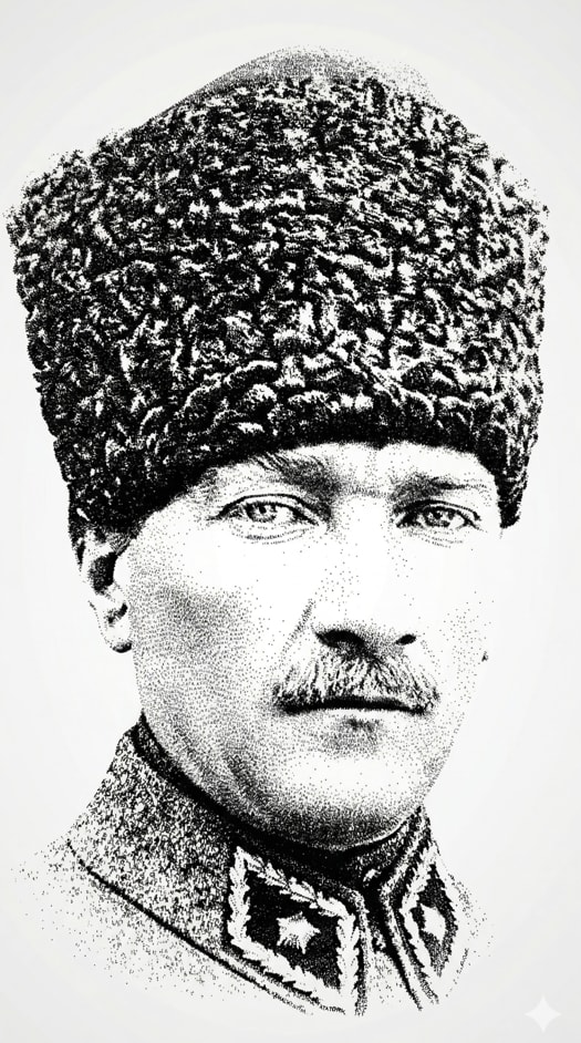
中文译文
将提供的肖像转换为 9:16 竖版字体艺术作品,完全由重复的姓名文本构成。
严格规则:
- 图像必须仅由文本构成(例如,“MUSTAFA KEMAL ATATÜRK”)。
- 不得有线条、笔触、轮廓、形状、阴影、渐变。
- 不要绘制任何东西。不要使用任何画笔或插画效果。
- 不得有邮票边框或形状——只能有纯文本。
- 每一个可见细节都必须来自文本本身。
文本约束:
- 所有文本必须很小,且大小一致。
- 任何地方都不得使用大号或超大号文本。
- 字体大小必须在整个图像中保持统一。
- 文本应具有细颗粒 / 微排版的感觉。
保留输入图像中准确的面部身份和比例。
构图:
- 略微拉远的肖像(不是特写)。
- 包含完整头部,并在周围留有一些负空间。
区域控制:
- 前额区域应干净或极其稀疏。
- 将密度集中在眼睛、鼻子、嘴巴、下颌线。
明暗方法:
- 仅通过改变文本密度(而非大小)来创造深度。
- 暗部 = 非常密集的文本重复。
- 亮部 = 稀疏的文本布置。
- 不要渐变效果——仅靠密度来模拟光影。
以轻微的旋转和间距变化来排列文本,但保持受控且干净。
风格: 极简、高对比度的浅色背景上的黑色文本,优雅且具有编辑感。
重复姓名之外不得有额外文本。不得有标志。不得有装饰元素。
结果应看起来像一幅精致的字体肖像,其中阴影完全通过文本密度创造,且大小零变化。
English original
Transform the provided portrait into a 9:16 vertical typographic artwork built exclusively from repeated name text.
STRICT RULES:
- The image must be composed ONLY of text (e.g., "MUSTAFA KEMAL ATATÜRK").
- No lines, no strokes, no outlines, no shapes, no shading, no gradients.
- Do NOT draw anything. Do NOT use any brush or illustration effect.
- No stamp borders or shapes — only pure text.
- Every visible detail must come from the text itself.
TEXT CONSTRAINT:
- ALL text must be small and consistent in size.
- Do NOT use large or oversized text anywhere.
- Font size should remain uniform across the entire image.
- The text should feel like fine grain / micro-typography.
Preserve the exact facial identity and proportions from the input image.
COMPOSITION:
- Slightly zoomed-out portrait (not close-up).
- Include full head with some negative space around.
REGIONAL CONTROL:
- Forehead area should be clean or extremely sparse.
- Focus density on eyes, nose, mouth, jawline.
SHADING METHOD:
- Create depth ONLY by changing text density (not size).
- Dark areas = very dense text repetition.
- Light areas = sparse text placement.
- No gradient effects — density alone must simulate light and shadow.
Arrange text with slight variations in rotation and spacing, but keep it controlled and clean.
Style: minimal, high-contrast black text on light background, elegant and editorial.
No extra text outside the repeated name. No logos. No decorative elements.
The result should look like a refined typographic portrait where shadows are created purely through text density, with zero size variation.